
Luke - UX Designer
I’m a UX Designer and Service Design Specialist, and CEO of DamnFineDigital.
I’m a Doctor of Psychology too.
I’ve worked alongside clients in the private and public sectors, and have lead a variety of projects from inception to launch, including several systems for the UK government.
My design philosophy can be encapsulated in one word: simplify.
Keep it simple. Keep it smart.
Below are the clients I’ve worked for, along with a couple of case studies highlighting recent projects.


Senior Interaction Designer
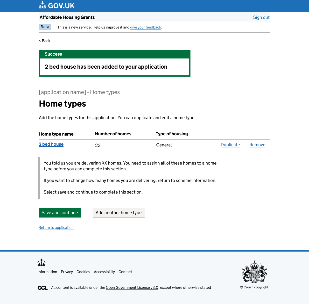
I was parachuted into a team struggling with a project designed to enable homebuilders in the UK to apply for government grants.
My goal: to simplify and streamline the core deliverable so it could hit its tight policy-set deadline, and steam through the mandated GDS assessments.
Having successfully taken a number of projects through GDS assessments in the past, I knew what the team needed to focus on. I spearheaded a greater focus on accessibility, on the reuse of existing GDS components (especially existing code), and overhauled the way designs and acceptance criteria were communicated to developers to minimise misunderstandings and rework.

Senior UX Designer
For 2 years I designed a system that would allow UK-based energy installations to apply for emission permits, define their plans to monitor emissions, verify emissions with independent bodies, and provide emissions reports to regulators.
This replaced an existing EU system.
I started work on this project during the discovery stage, and lead it through a successful 2-hour GDS public beta assessment.
The system (called Manage your UK Emissions Trading Scheme) is now live and being used by tens of thousands of users.


Service Designer
During the height of the Coronavirus pandemic I worked with the Department for Education to design an all-in-one solution for hosting the department’s myriad services.
With Super Mario 64 firmly in mind, I designed a central hub that would allow people to find and access the services they needed to use.
As Service Designer, I managed the user research, the UX/UI work, the user-architecture of the full system, and the content writing of each and every page.
I also guided the project through several GDS assessments, right up to public release.


Senior UX/UI Designer
A start-up fashion brand asked me to design and build their entire website from the ground up, as well as an app for users to digitally ‘try on’ clothing items.
This was a fun, fast project that involved everything from market research and persona production through to user interface design, copywriting, and spending a week trying to get parallax scrolling to work using Kotlin.


Senior UX Writer
Two main projects occupied my time at Barclaycard.
The first was a new dashboard for Barclays' converged payment gateway. I shaped the UX/UI of this dashboard, as well as its child pages, through the production of a narrative strategy that could be easily picked up by future writers and copy editors.
The second project was a re-think of how high value transaction promotions were displayed in the existing Barclaycard customer portal.
This second project was all about simplification - the presentation had to be clear, and the content needed to be understood by even the most finance-blind person.
It was a fun challenge that lead to some very memorable user testing sessions.


Narrative Service Design Specialist
I was brought into the SRA to help them rework and modernise their approach to content writing.
To do this, I created a smörgåsbord of copy-related artefacts for use within the company, including…
A ‘copy efficacy scale’ to help managers determine whether or not content was up to a modern UX standard.
Personas to help the SRA copywriters empathise with their external audience.
An easy-to-read booklet outlining the major UX writing principles, such as progressive disclosure, clarity, brevity, and how to write for mobile devices.

Case Study - DESNZ
Scope
The Department for Energy Security and Net Zero (DESNZ) brought me on to design a system that would allow UK-based energy installations to apply for emission permits.
This was to replace an existing system that was being used as a stop-gap following Brexit.
At first the system was targeted at static installations, such as power plants. Mid-way through the scope shifted, so that the system also needed to accommodate aviation emitters, including aircraft flying through UK airspace.
Being a government system, it also needed to pass a round of assessments from the government’s internal design experts. If it couldn’t get through these GDS assessments then it would never go live, and users would be stuck with a legacy system that looked like it was last iterated upon in 1992...
Involvement
Senior UX/UI Designer
Service Designer
User Researcher
Date
April 2022 - November 2023
Tools
Whimsical
Axure
InVision
Notion
Balsamiq

Mapping the legacy system
One of the first tasks on this project was to map out the system we planned to replace.
This was done in collaboration with a Business Analyst and several members of the Environment Agency who were familiar with the ins and outs of this system.

Identifying pain points
Before diving in with hammer and chisel I needed to identify what gave users grief, and what worked well.
To do this, I interviewed members of regulatory bodies such as the Environment Agency and the Offshore Petroleum Regulator for Environment and Decommissioning.

Employing the Government Design System
The UK government has a robust and well tested design system (GDS) that must be used across any systems within government.
Ensuring that prototypes and designs met GDS standards from the get-go had benefits for consistency and usability, and also meant it’d be easier to pass future internal assessments.

Transforming core pages
These three images demonstrate the design development of the system’s core areas over the project.
Our example is a ‘task page’. This is the first page users see when they log in. It shows all the work they have been assigned.
So what changed?
Well, the navigation shifted from a vertical left-alignment to sitting atop the page, as per the standard user schemata for modern websites.
The name of the task was given prominence, as that was identified as the information users most wanted from a task page (shocking, I know).
Link signifiers were made more obvious so that users could understand how to get to the individual tasks.
And information was condensed and (in the final version) arranged vertically. This ameliorated the layout issues in the legacy system where users had to horizontally scroll to reveal pertinent information.
As with all pages in this system regular user feedback was the special sauce that led to creating the most user-friendly designs.
These examples are from test environments and contain dummy data.

Making paper forms digital
It wasn’t all just updating the legacy system to a modern design - there were also several large processes that needed to be digitised for the first time.
Regulators were using a mix of paper forms, emails, and complex databases to complete such tasks as ‘annual emission reports’ and ‘new entrant reserve applications’. If we could make these tasks digital they would be easier and faster to complete.
This ‘digital transformation’ process was on-going for the full life-cycle of the project, and involved discussions with regulators, operators, and legal experts.
A few examples are on display here. These are Axure prototypes from various stages of development.

Passing the GDS assessments
Before a service can go live, you need to show that you’ve built a service that meets the needs identified at discovery, and that you’ve tested and iterated based on what’s been learnt.
To do this, I worked with the entire team to craft a story that showed our design processes, and how we were crafting a system with the user firmly in mind.
This story-driven approach led to a thumbs up from the assessors and a pass for all stages of GDS assessment.

Post-launch support
When a system goes live support shouldn’t screech to a halt.
Instead, focus should shift to the ‘back log’: that hinterland of changes and improvements that need doing, but couldn’t fit into the go-live schedule.
There were approximately 350 changes in the back log that needed tackling post-launch. Some were small (e.g., a text change, a new button), and some were enormous (such as implementing brand new functionality).
The back log was spread across Trello and Confluence.
I managed this process with a small team, having regular sessions with regulators, writers, and legal experts. By the end of my contract I had created final designs for more than 50% of all items in the back log.